01 Oct Using the Rule of Three in Print Advertising
Ever heard a designer say that even numbers are boring? Odd number groupings in graphic design appear more harmonious and are great for creating focal points.
In graphic design, the “Rule of Three” is a fundamental principle. It suggests that things arranged in threes are more visually appealing and memorable. It’s based on the idea that groups of three create a more cohesive and balanced composition when compared to groups of two or four.
Many advertising professors teach the principle of thirds as a way to lay out a print design. Designs that use the rule of three will catch the reader’s eye more easily and hold their attention longer.
If you want people to actually read your ads, you need to learn how to use the rule of three. We explain how to apply this principle when designing print advertisements like posters, banners, and flyers.
How to Use the Rule of Three in Print Ads
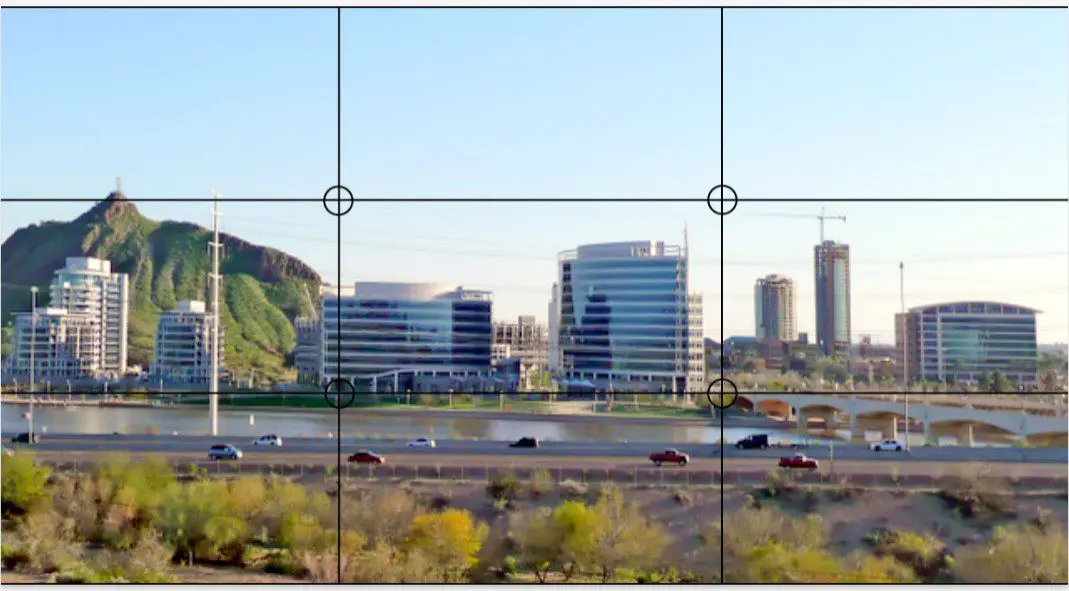
Imagine that your page is divided into nine equal parts. Two equally spaced horizontal lines and two equally spaced vertical lines cover the page. (See image below for an example.) This creates three horizontal bands and three vertical columns.
Using the rule of three will help distribute the visual weight evenly, so that it is balanced across your design. If you have a strong visual in the middle, make sure the text in the bottom third doesn’t overwhelm it.
Here’s how to designate the thirds of your advertisement:
- Headline—Five to fifteen words (the fewer the better) promoting the biggest benefit
- Visual Elements—Illustrations, photos, or artwork
- Body Copy and Signature—Describe the offer and list important information (business name, address or website, logo)
Each of these elements should visually take up one-third of the space. Remember, don’t over-design! Leave enough white space. It’s important because it prevents the reader from being overwhelmed with a busy block of color and jammed-in text.
Examples of How to Use the Rule of Three in Graphic Design
A graphic designer is creating a poster for a restaurant’s live music series this fall.
- Headline as the Top Third: “Fall Outdoor Concert Series!” They use a large, bold font to make the headline stand out.
Design Tip: The best positions for a headline are centered at the top, or on the top left where our brains automatically start reading.
- Main Visual as the Center Third: Next, they select a high-quality, engaging image of a concert scene with the lead artist performing. This image captures the essence of the event, and appeals to the target audience.
Design Tip: Position the image so that it spans most of the central third. This focal point will likely be what people see first.
- Event Details as the Bottom Third: Finally, they include the specific details about the event: “Westside Brewhaus | Every Saturday, September – November 6 PM – 9 PM | Stop By for Cocktails and Live Music on the Patio!”
Design Tip: Position the copy and signature at the bottom right, or slightly overlapping your imagery.
High Quality Printing in Tempe, Arizona
Now that you’re comfortable knowing how to use the rule of three in print ads – it’s time to work on your project. Ready to display your outstanding design? You need to make sure it’s printed perfectly! The digital print specialists at Mousegraphics have been printing high-quality advertisements for Tempe businesses for over 30 years. If you’re looking for an experienced, local partner who can help make your designs pop off the page, contact us today at (480) 894-1992.

Photo by Nick from Wikimedia Commons on 9.10.2024. | Used under a creative commons license – commercial use. | Edits were made: grid of thirds was placed over original image.


